In this article:
Report Reviews
For this part of the exercise, we are taking a closer look at reports and how to review reports.
Reviewing Reports for an NIST CSF Assessment
-
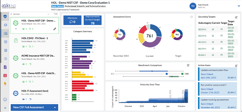
Navigate to the HOL – Demo NIST CSF – Demo Corp Evaluation Assessment (select the card rather than the hyperlink to access Assessment details).
-
Category Summary:
For the NIST CSF model assessment, this report shows the overall % score for each category (e.g., ID.AM) within each function (e.g., ID), with each function’s category bars color-coded.
-
Assessment Score:
These show an assessment from a past date, the current assessment and a target assessment. This is a great visual to show progress in each function (e.g., PR) and overall since the last time you did an assessment and progress against your target. Axio uses a scale of 1,000 so that even relatively small progress can be seen and reported more easily. Each function is color-coded (e.g., DE is color-coded yellow)
-
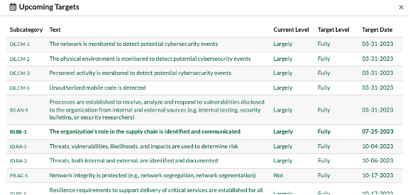
Upcoming Targets:
This has action items and specific items from the NIST CSF assessment due based on target dates. Select the pop-out button to show Upcoming Targets on a separate page with more viewing space. The pop-out page view allows one to see target dates for achieving different aspects of the NIST CSF assessment and the target maturity level for each.
-
Benchmark Comparison:
If you hover over each of the components of the bar-and-whisker charts shown under the Benchmark Comparison for each function of the NIST CSF assessment, you will see that they represent:
a. The middle 25% to 75% of the benchmarked scores on the top line (others in your industry). b. The current score for this function (the blue dot) – in the middle row. c. The current target score for this function (the green dot) in the middle row. d. The current target range for this function in the bottom row.
-
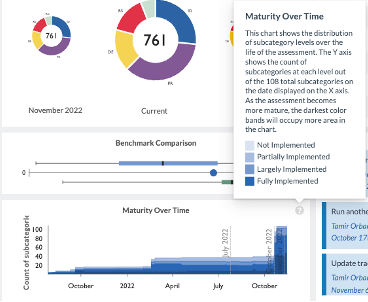
Maturity Over Time:
If you hover over the chart, you’ll notice a “?” icon, and if you click on that, you will get this explanation:
-
Action Items:
The Action Items list can also be viewed in pop-out page view mode to look at details and due dates.

-
Reviewing Reports for a C2M2 Assessment
Since each assessment type measures security from different aspects, the charts for the C2M2 assessment differ from those for the NIST CSF assessment. We are using the HOL C2M2v2.1 – FS Client assessment report for this review.
-
Navigate to the HOL C2M2v2.1 – FS Client (select the card rather than the hyperlink to access Assessment details).
The CSF and the C2M2 assessments have the following charts in common:
- Assessment Score
- Score Comparison
- Upcoming Targets
- Maturity Over Time
- Action Items
The report differences are the following:
-
MIL Completion by Domain:
This chart shows the % of all practices at each MIL level that are either Fully Implemented or Largely Implemented by Domain. The span of each bar represents 0 to 100% complete for that specific MIL.
The NIST CSF assessment refers to Functions, Categories, and Subcategories. The C2M2 v2.1 refers to the same as Domain, Objectives, and Practices.
The acronym MIL refers to Maturity Indicator Level and can span from 0-3.
Using the Aggregates Dashboard
Axio360 allows users to view a rollup of multiple assessments of the same type. This only works across assessments of different types. This part of the exercise details how to use the Aggregates Dashboard.
-
To narrow down the list of assessments to just C2M2 Version 2.1, in the top right corner of your current screen, click the Filter icon.

-
From the filter module, select C2M2 Version 2.1.
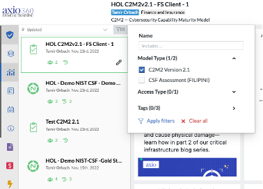
- Click Apply filters.
-
From the left tools menu, select Aggregates Dashboard.
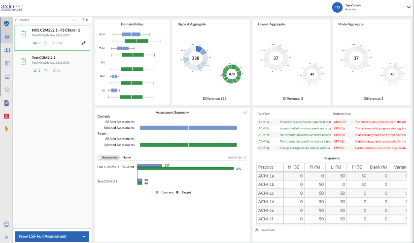
- Target Values are green.
- Actual Values are blue.
-
Assessment Summary:
The Assessment Summary stacks the assessments against each other. Users can compare the scores of each to the other – with the blue values representing the actual values.
-
Domain Rollup:
The Domain Rollup shows a series of box plots with the breakdown scores across each domain amongst the selected assessments. The scores represent, at a high level, the points achieved per domain out of the total possible. The boxes and whiskers indicate the scores’ minimum, maximum, median, and interquartile ranges. This is helpful when looking for cross-organizational areas of weakness quickly across multiple assessments in a single organization. For example, in the WM domain is particularly low across all three assessments as compared to the median across the industry (the whiskers show the min and max values, so comparing the values to the whiskers is the best way to measure how well a company is doing in a given domain) and may be a good area to focus on in this case.
-
Aggregate Wheels:
The Highest Aggregate, Lowest Aggregate, and Mode Aggregate wheels represent the highest aggregate actual values (blue) of the assessments in the list and the highest aggregate target values (green) of the assessments in the list, the lowest aggregate values and target values, and the Mode (the number that occurs most frequently) aggregate values and target values across all categories of the C2M2 v2.1.
-
Responses Chart:
The Responses chart shows one level deeper than the Domain Rollup but the different score levels not just by domain but also by function and practices. So, a user can look for specific practices that need work across the organization. NI means Not Implemented so looking for that value is a good way to find areas of weakness. In this case for example, click on NI to reorder results by Not Implemented, and order them from highest to lowest. This will show you the practices with the highest %s in the organization not currently implemented.
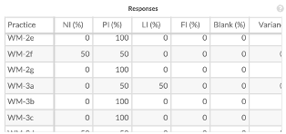
In this case, WM-2e, which corresponds to “Workforce Management – Cybersecurity awareness activities are tailored to job roles, which is a partially implemented area across the organization based on the two assessments of this type that we have – hence the value “100” in the “PI(%)” column.
To see trends across an organization, Axio recommends, after looking at Not Implemented, to look at PI or partially implemented.