Benchmarks
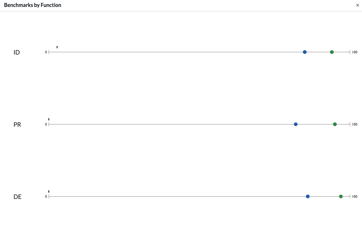
Benchmark comparison charts show current and targeted assessment scores. The blue dot shows the current score, and the green dot shows the targeted score. Gray dots indicate milestone scores.


Blue box plots show the system-wide min, max, median, and interquartile range for the current profile scores, while green box plots show the data for the target profile scores.
