In this article:
UI Reference
This content section of the Axio360 documentation is a user interface reference that explains all UI elements, product layout, and navigation.
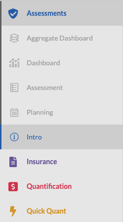
Module Overview - Left Navigation Menu
At the bottom of the left navigation area, use the right or left-pointing chevrons to expand and collapse the left sidebar navigation. Icons and labels are visible when the sidebar is expanded. The expanded sidebar displays over the active work tray. A collapsed sidebar displays icons only.
Sidebar navigation entry points:
- Assessments
- Aggregate Dashboard
- Dashboard
- Assessment
- Planning
- Intro
- Insurance
- Quantification
- Quick Quant
- Admin View - only visible if the user is in the Admin group

Home * Learn more about Axio
The Axio logo on the top left is the navigation point to the corporate website.
Feedback
The feedback option allows our customers to provide valuable input to our product management team about likes and dislikes while using the Axio Platform.
Deprecation Messages
Axio will provide information to users about assessment deprecations. Deprecations become necessary to stay current and to provide the latest insights in the assessment and risk quantification process based on market insights.
Example
An assessment version is being replaced by a new version.

Table of contents
- Module Navigation - The assessment module is the entry point to view and open existing assessments and to create new assessments based on supported assessment models
- Admin View - Company instance administration view
- Quadrant Help Texts
- Benchmarks
- Custom Help
- Edit Profile
- Gauges and Scores
- History and Comparisons
- Partial Credit
- Permissions
- Widgets